Visuals
The visual identity for Wilbur Wright College brings the system-wide and Wright-specific brand strategy to life in unique and impactful ways. As with all aspects of the Wright brand, the visual identity builds upon the system-wide visual identity. Read the system-wide visual guidelines as a starting point to creating marketing communications for Wright.
Use these guidelines to ensure both consistency and that the unique character and personality of Wilbur Wright College is captured throughout design and layout.
College Logos
Primary
The most fundamental visual element of the Wilbur Wright brand identity is its logo. The primary logo, shown here, is our key identifier for Wilbur Wright College. It’s the most formal logo option and preferred for placement whenever possible. It’s essential that Wilbur Wright College logos are used in a manner that adheres to the rules explained in this section.

Secondary
A secondary logo for Wilbur Wright is an alternate option available for use when a more casual, or more compact and vertical logo is needed. Note that in the secondary logo, the word “College” has been eliminated. Using this logo is most appropriate when other context for the college has been provided. For instance, you may use this logo on campus where the environment indicates that this is a college.

Secondary Alt
A secondary alternate logo is available to use for the most casual, on-campus applications only. This logo should be used sparingly and only within context where the full college name is already known.

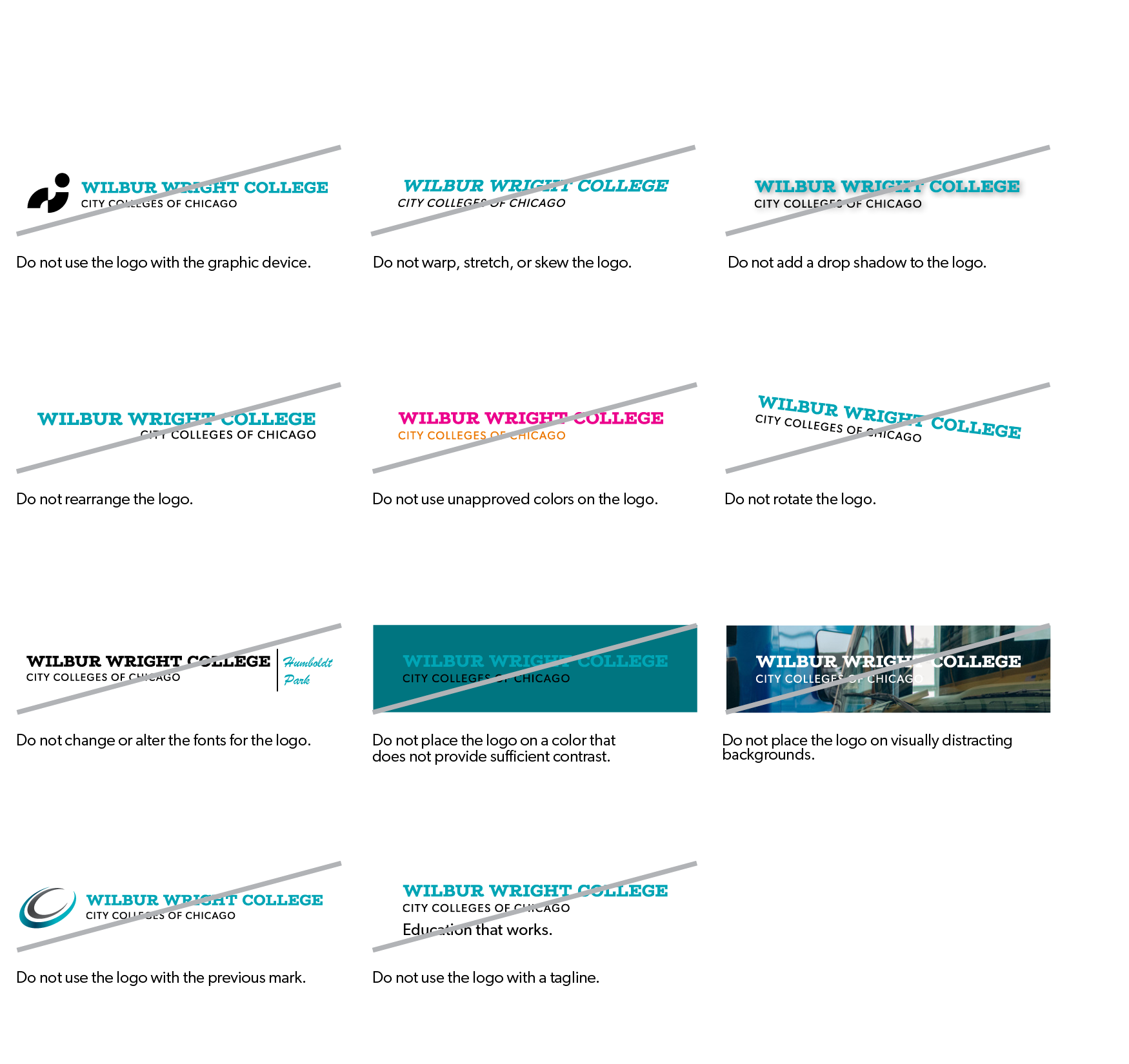
DON’T RECREATE, MODIFY, OR APPLY VISUAL EFFECTS TO THE WRIGHT LOGO ART IN ANY WAY.
DON’T ALTER, REDRAW, OR ADD ANY ADDITIONAL WORDS OR GRAPHIC ELEMENTS TO THE LOGO.
DON’T RETYPESET OR USE THE LOGO AS PART OF A SENTENCE OR PHRASE.
Versions
All Wilbur Wright primary and secondary logos are available in multiple color versions. Here is an explanation of when and where to use each one.
2-color
The Pantone (PMS), CMYK, or RGB 2-color logo is the preferred version for placement on communications materials whenever possible. Use PMS or CMYK for any print applications such as collateral. Use RGB for digital applications such as web, presentations, or video.
The primary 2-color + reverse version can be used on dark backgrounds. Be sure to place on a color that provides ample contrast for maximum legibility.
Primary


Secondary


Secondary Alt


1-color
1-color versions of the Wilbur Wright primary logo have been produced for use where reproduction values are limited. This is also helpful for applications such as embossing, debossing, die-cutting, or extrusion.
Primary


Secondary


Secondary Alt


Reverse
Additionally, a reverse version of the Wilbur Wright logo may be used for applications on color or photographic backgrounds. Always ensure that the background you choose provides sufficient contrast for the logo.
Primary

Secondary

Secondary Alt

DON’T RECREATE, MODIFY, OR APPLY VISUAL EFFECTS TO THE WRIGHT LOGO ART IN ANY WAY.
DON’T ALTER, REDRAW, OR ADD ANY ADDITIONAL WORDS OR GRAPHIC ELEMENTS TO THE LOGO.
DON’T RETYPESET OR USE THE LOGO AS PART OF A SENTENCE OR PHRASE.
Department Level
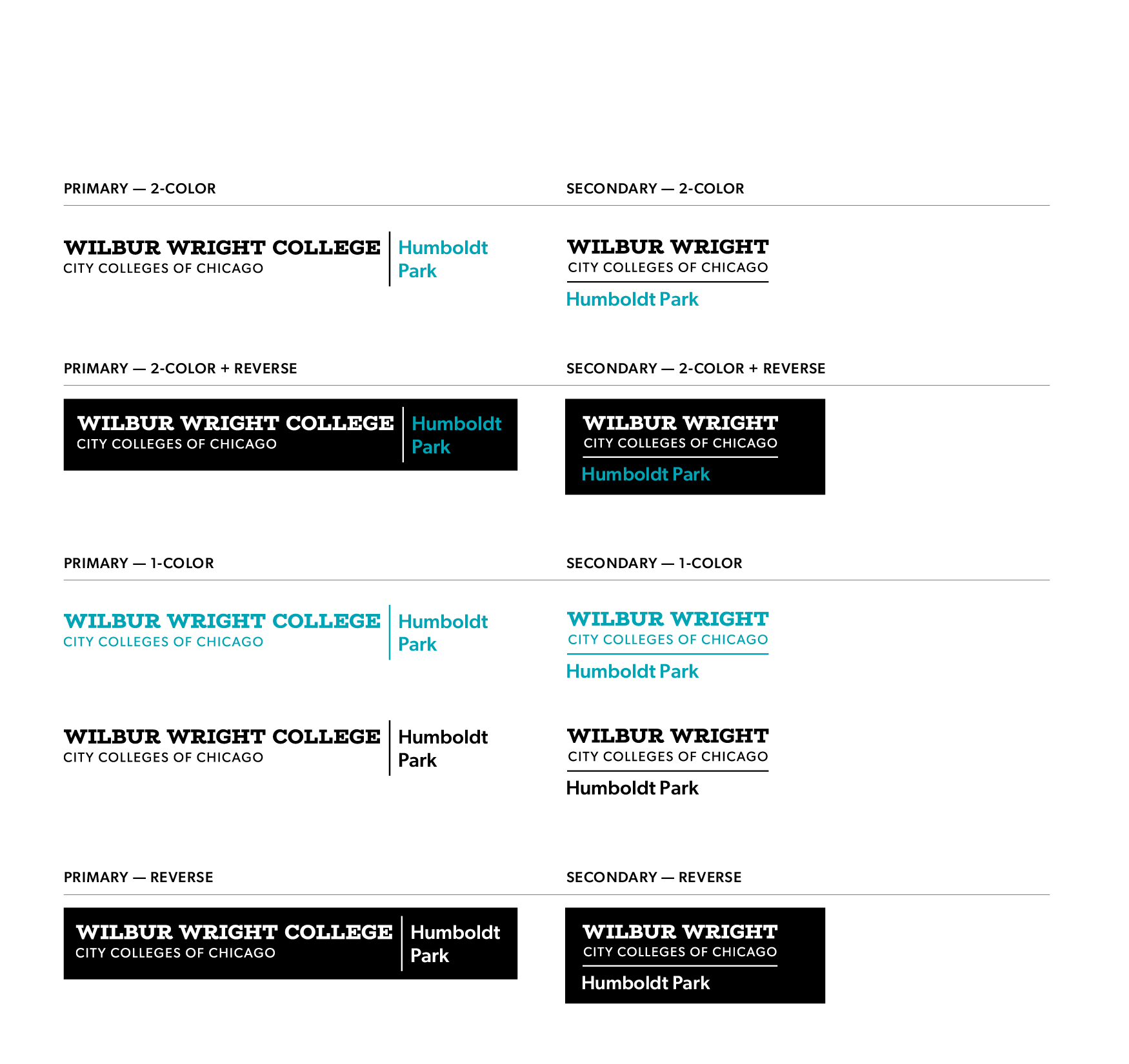
There are times when the Wright primary and secondary logos will also need to represent a specific department, satellite campus, or program. For these instances, the department-level logo shown to the right should be used. This variation provides a flexible tertiary line of copy and is available in both primary and secondary formats.
Click to enlarge:


