Visuals
This is City Colleges of Chicago’s visual identity. It’s how we look, move and come to life on the web, in social, in environments, and in print.
Along with the logo, typography, color palette, photography, and graphic elements, specific directions are included to help everyone manage all visual communication materials.
SYSTEM LOGOS
The most fundamental visual element of a brand identity is its logo. The City Colleges logo, shown here, signals change and represents a new vision for the future while giving a nod to our past. It’s essential that the logo is used in a manner that adheres to the rules explained in this section.
This 2-color version of the City Colleges system logo is the preferred option and is strongly recommended to be used in branded applications whenever possible.

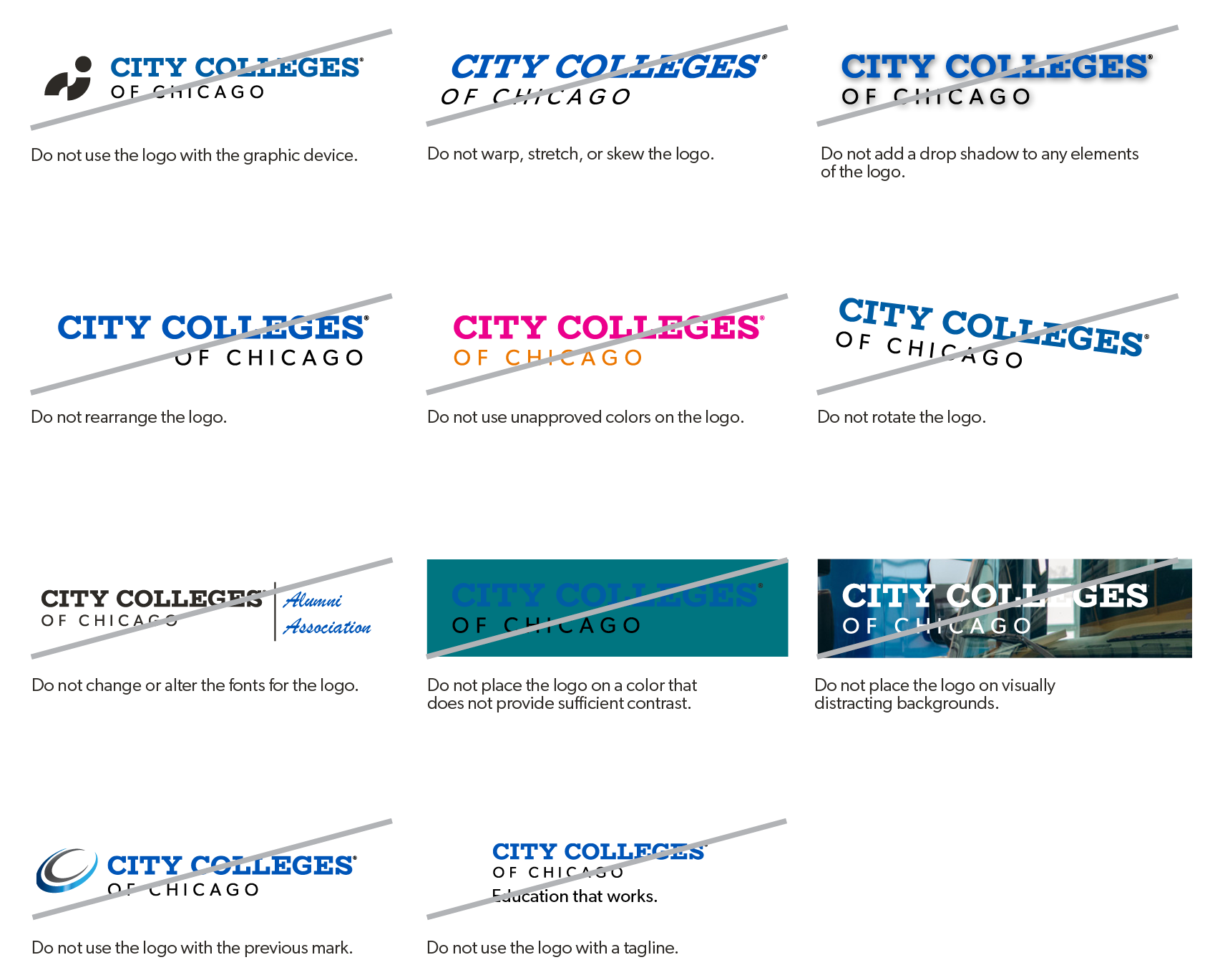
DON’T recreate, modify, or apply visual effects to the logo art in any way.
DON’T alter, redraw, or add any additional words or graphic elements to the logo.
DON’T retypeset or use the logo as part of a sentence or phrase.
VERSIONS
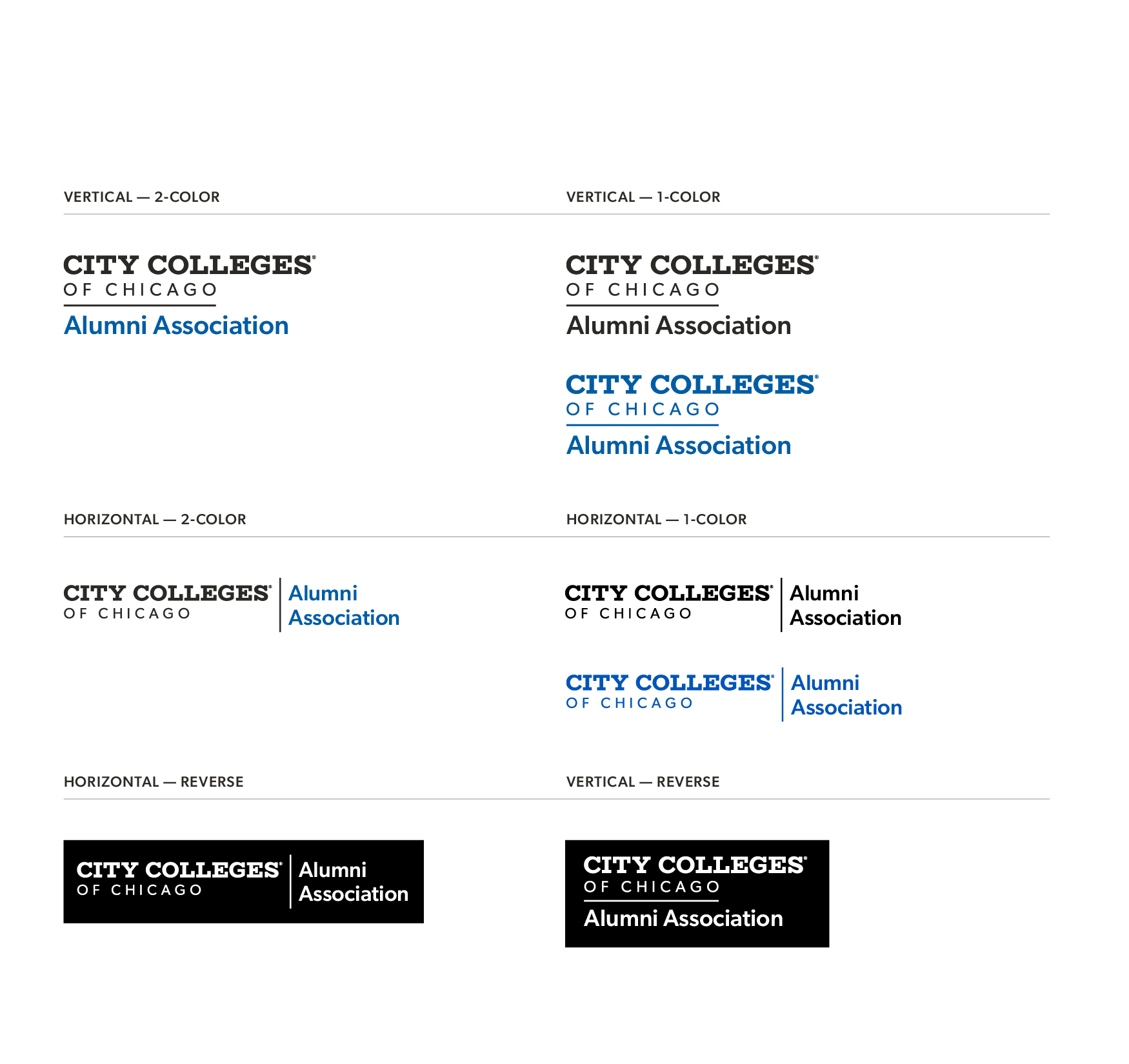
Our logos are available in multiple color variations. Here is an explanation of when and where to use each one.
2-color
The Pantone, CMYK or RGB 2-color logo is the preferred version for placement on communications materials whenever possible. Use Pantone or CMYK for any print applications such as collateral. Use RGB for digital applications such as web, presentations, or video.

1-color
1-color versions of the brandmarks have been produced for use where reproduction values are limited. This is also helpful for applications such as embossing, debossing, die-cutting, or extrusion.


Reverse
Additionally, a reverse version of the logo may be used for applications on color or photographic backgrounds. Always ensure that the background you choose provides sufficient contrast for the logo.

DON’T recreate, modify, or apply visual effects to the logo art in any way.
DON’T alter, redraw, or add any additional words or graphic elements to the logo.
DON’T retypeset or use the logo as part of a sentence or phrase.
department level
There are times when the City Colleges system logo will also need to represent a specific department or program. For these instances, an alternate option of the system logo should be used. This variation provides a tertiary line of copy, available in both vertical and horizontal orientations.
Click to enlarge:


